Originally drawn by Cyrus Highsmith in 2006 for the headlines of Entertainment Weekly, Scout has gained popularity in publications and brands of all kinds. In 2013, Highsmith added Scout RE, four styles optimized for text on the screen and small sizes in print. Now there’s Scout Text, for everything in between.


In addition to adjusting the proportions and spacing in Scout Text, Highsmith altered the design of the a and l to incorporate tails. “In the original family, I drew plainer versions of a and l because tails can interfere with the spacing in a compact headline,” he said. “In the text version, there is more breathing room between the letters—the tails don’t interrupt the flow.”
Highsmith said the tail on the l was to aid legibility and prevent confusion with the uppercase I, but “the tail on the a was so the new l didn’t feel lonely. I like how these new forms add to the character of the family.” Plain versions of the a and l, without tails, are included as stylistic alternates, accessible via the OpenType features.

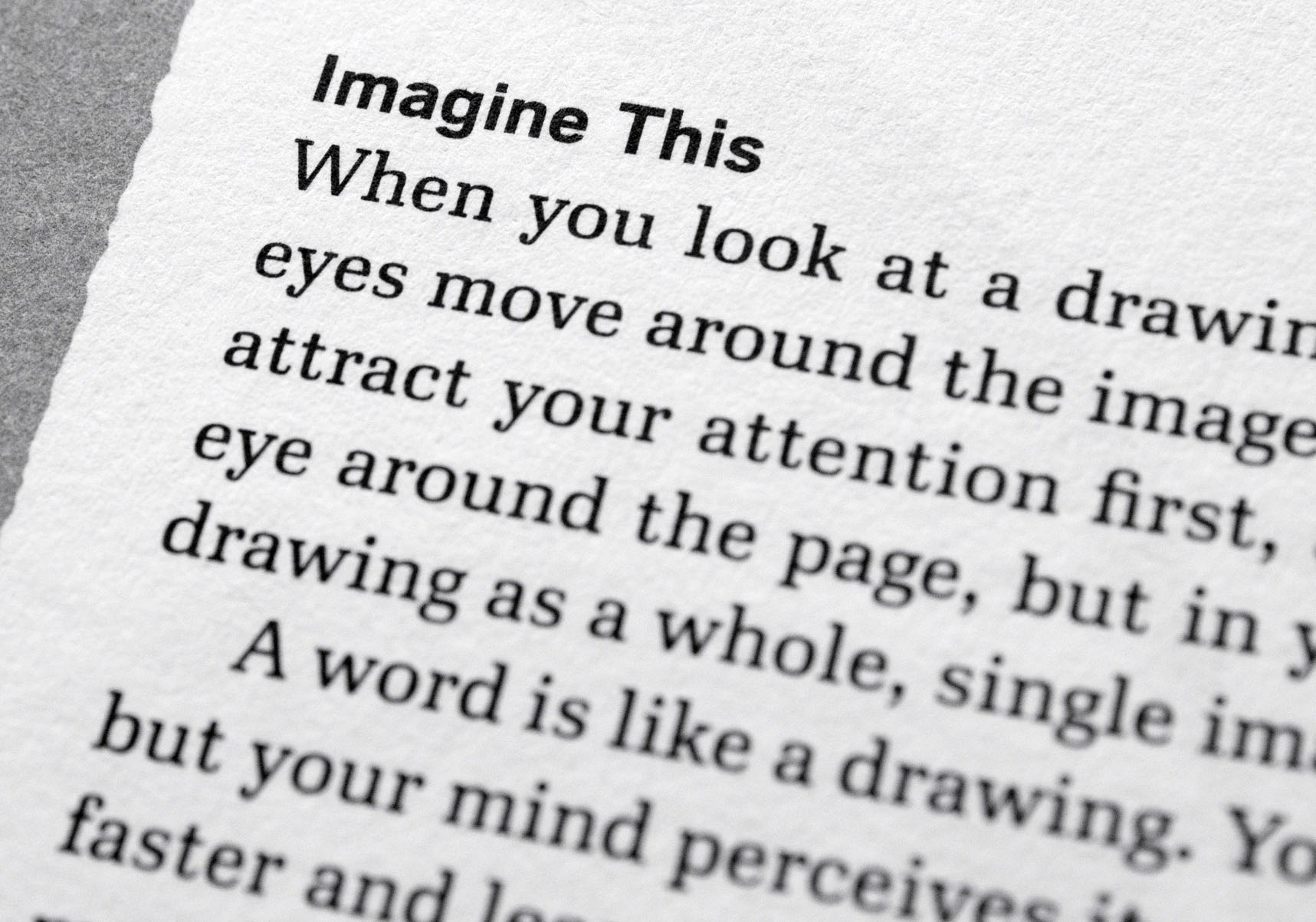
Scout pairs well with other typefaces because it doesn’t draw too much attention to itself. Highsmith used it in his book, Inside Paragraphs, for section heads, page numbers, and other functional areas. “Scout goes well with Ibis, which I chose for the body text,” he said. “My intention was that this combination would give the book a kind of scientific or instructional tone.”
Like all Occupant Fonts releases, Scout is available for print, web, applications, and ePub licensing on Type Network. Webfonts may be tested free for thirty days.