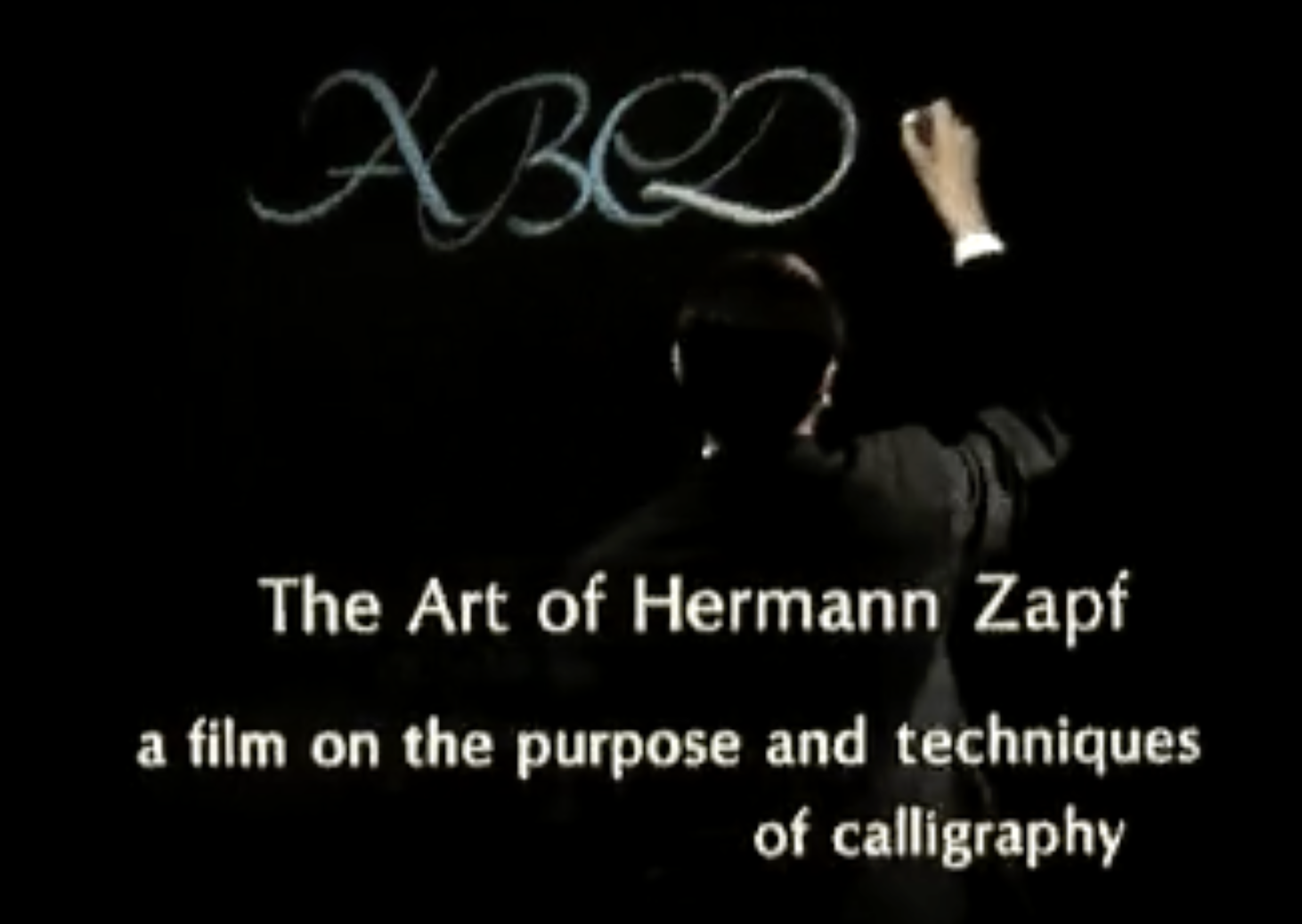
I have screened The Art of Hermann Zapf for my type design students many times over the years. It’s a short educational film produced by Hallmark Cards in 1967. Its goal was to promote the art of calligraphy.
In the film, Zapf is shown working in his sunlit atelier in Dreieichenhain, Germany. He is wearing a well-pressed white dress shirt with cufflinks. He recommends using only the best pen nibs forged from German steel, handmade paper, and sumi ink mixed with rainwater.
However, this doesn’t stop him from proving that the old saying about bad artisans blaming their tools is true. Towards the end of the film, Zapf demonstrates you can also make excellent calligraphy with a cheap ballpoint pen on a legal pad. Along the way, he casually shares so much valuable practical advice it might not make much of an impression at first. Zapf was a true master of his craft.
The film was made over fifty years ago—it’s visual style and the didactic tone seem quite dated to viewers now. This often causes a fair amount of laughter among my students especially during the first few minutes. As the film progresses, the classroom gets quieter and quieter. Watching Zapf draw one beautiful letter after another leaves the students speechless. I’m still impressed and inspired every time I see it even after dozens of viewings.
Here is a link to the film on Vimeo. We don’t know if this is an authorized use or not but it’s been up there for 14 years. You can also find it on youtube and other sites with a little searching.