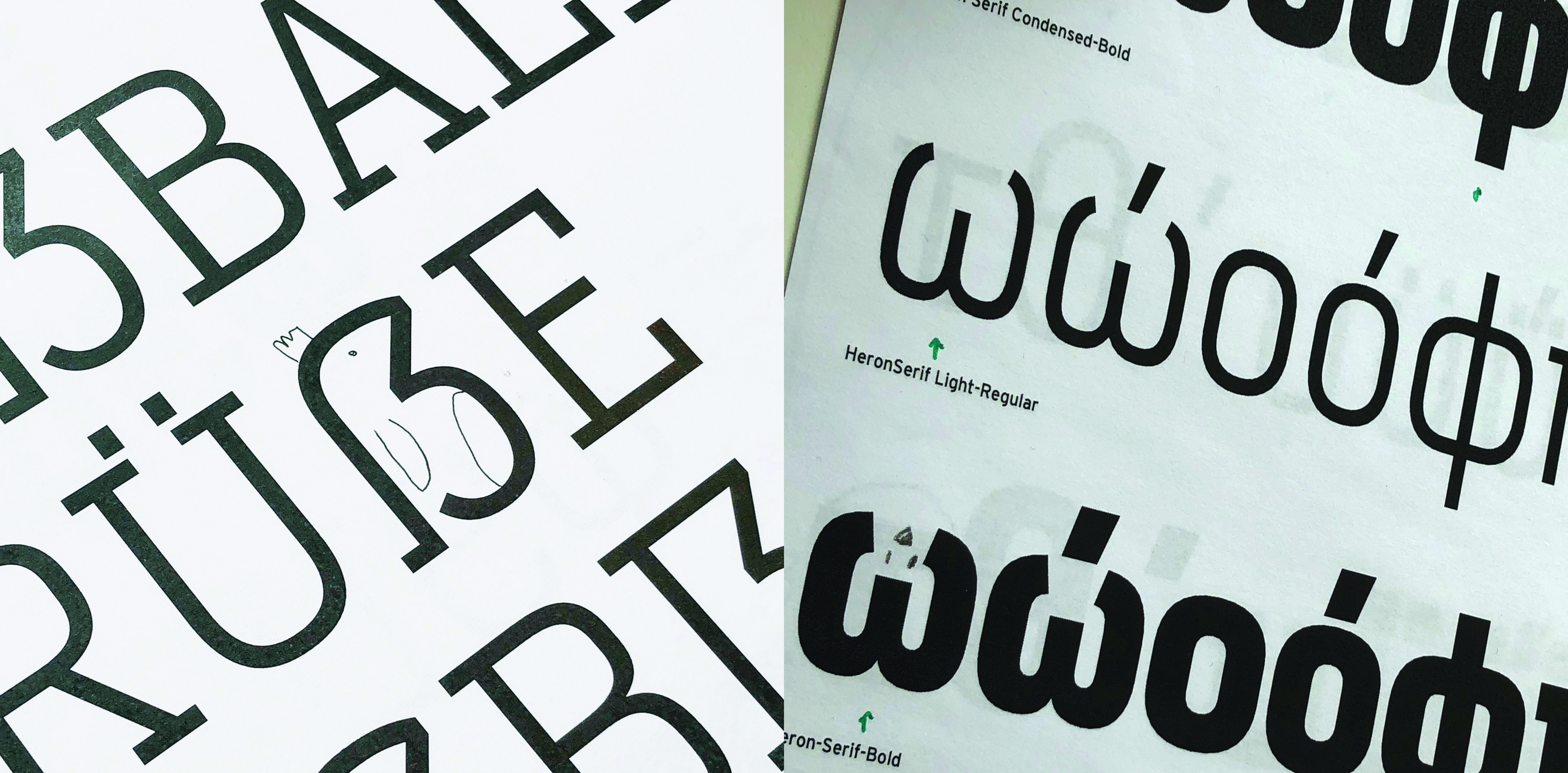
Cyrus Highsmith, June Shin, Cem Eskinazi, and Marie Otsuka share an illustrative approach to type design. In the summer of 2018, the Occupant Fonts team was working on redrawing Scout and Heron. Many of the proofs ended up with doodles of animals hiding between and inside the letters. This sparked the idea for Occupant’s first type catalogue, How to Speak Rooster, a children’s book that teaches its readers to “speak rooster” in six languages.
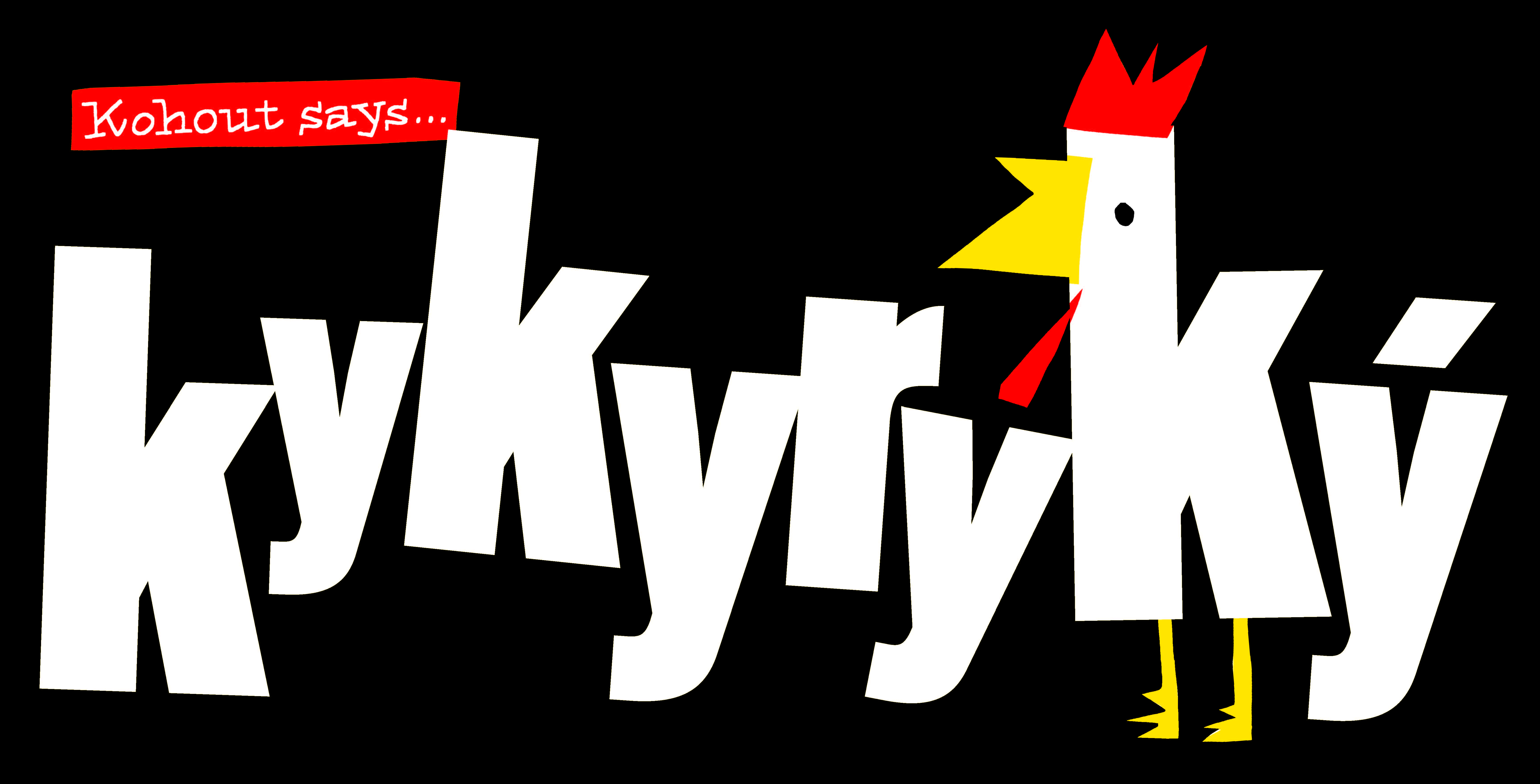
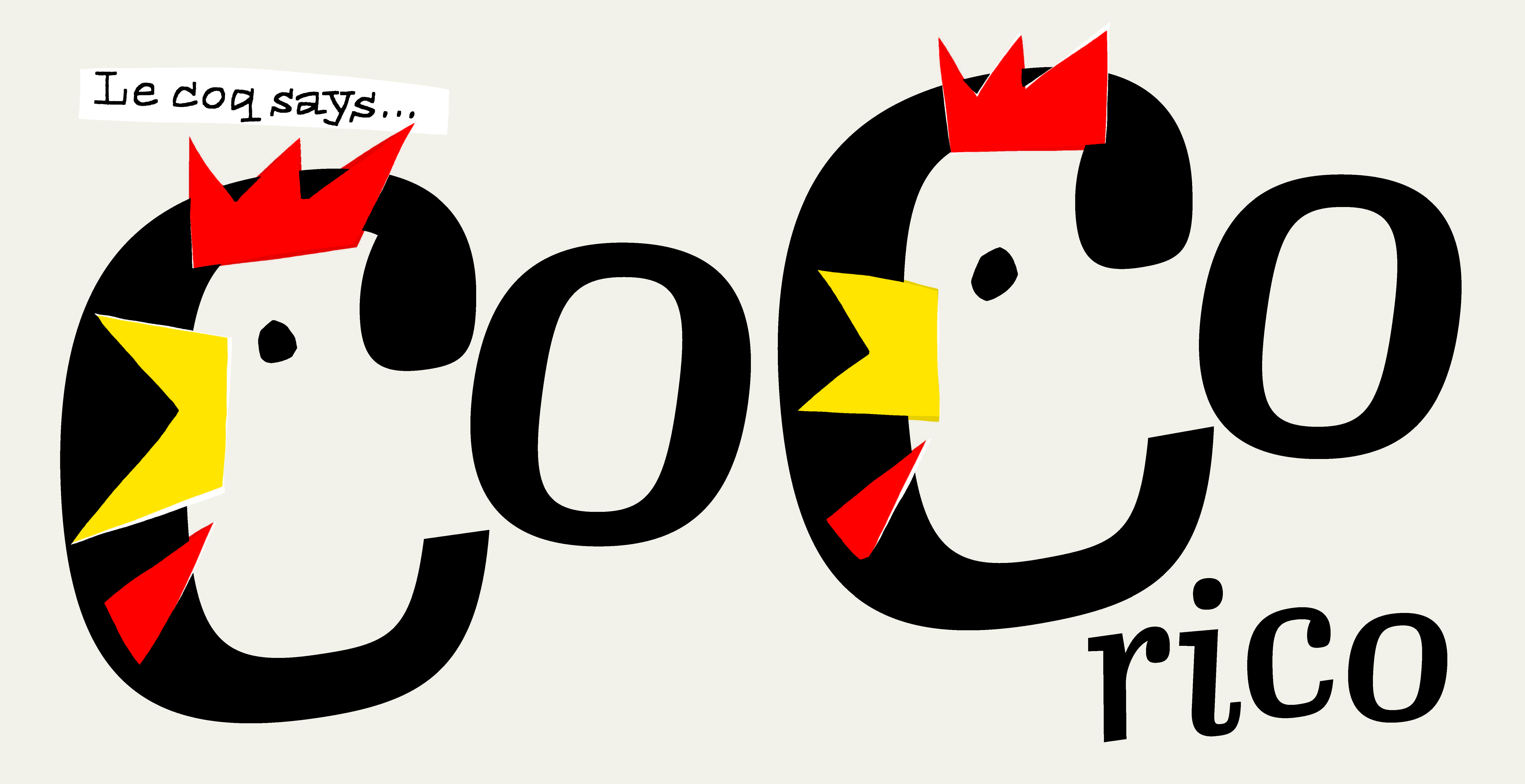
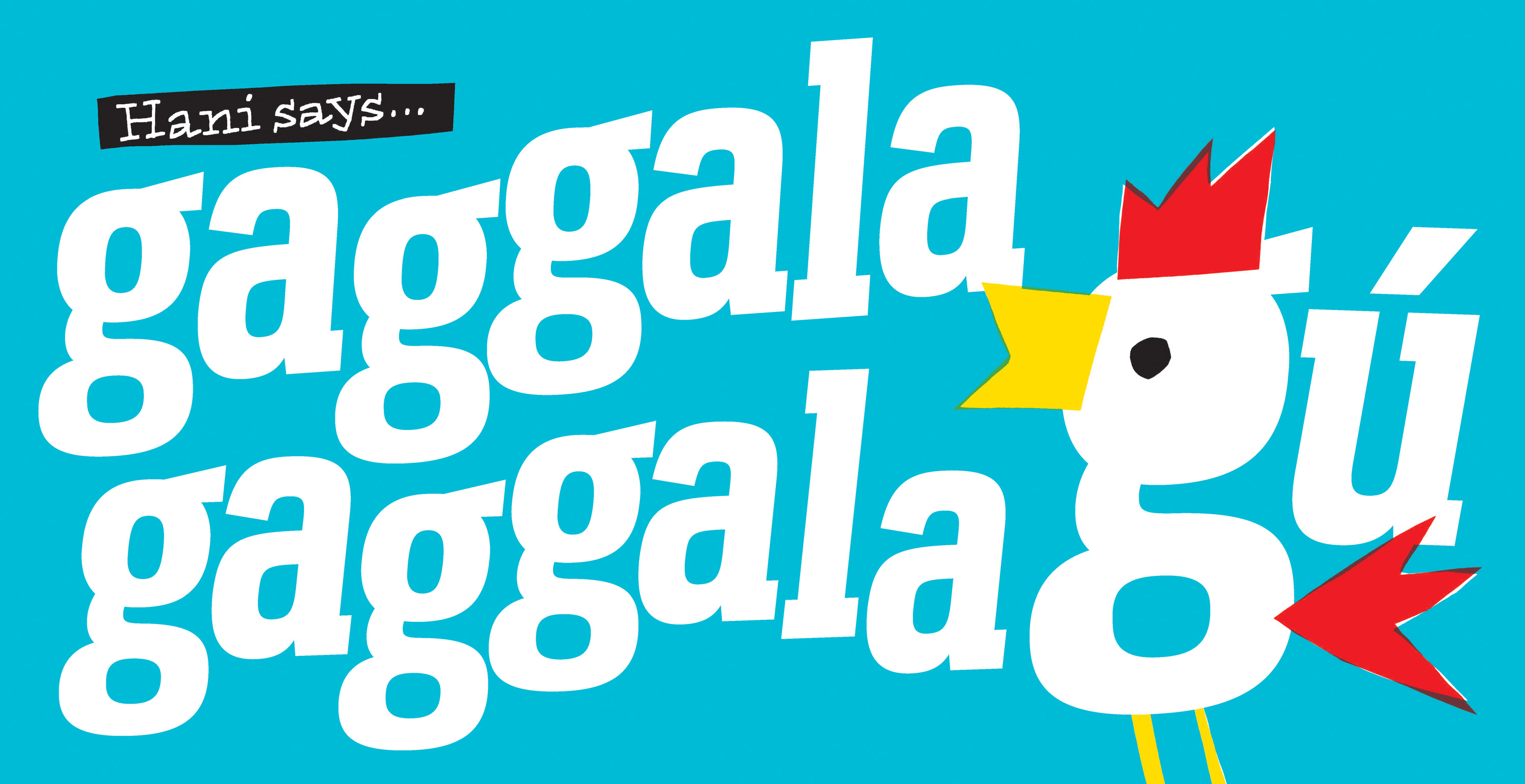
The languages used in Rooster were chosen for a combination of reasons — mostly, the focus was on good letters that would make nicely shaped words. The team used the internet to research the rooster’s crow in different languages, and cross-checked with friends and colleagues who are native speakers. For some rooster sounds, they never got confirmation. What the rooster says in Portuguese is still up for debate.
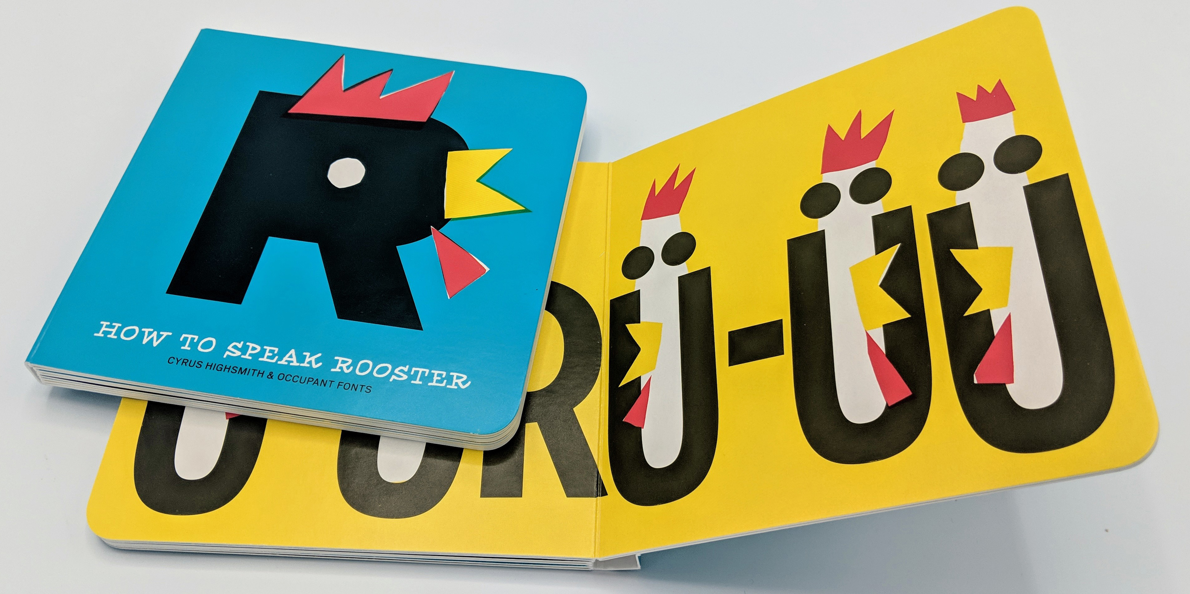
Highsmith sketched by hand, then reassembled the book spreads digitally using simple color separations that reference older comic books. How to Speak Rooster was printed in the United States at Pint Size Productions, in a run of 1,500 copies. Books are available from Draw Down Books, Katherine Small Gallery, and RISD Works.
The book joins a small collection of type-inspired children’s books. Highsmith knew Grilli Type’s recent alphabet book for GT Eesti, Apfel, Ball, und Cha-Cha-Cha (designed by Reto Moser), and Paul Shaw introduced him to a specimen book for children by Jules Didot from back in the 1800s. The Occupant Fonts team is excited about the possibility of a series — this playful approach feels like a good direction.
How to Speak Rooster does double duty as a type catalogue and gift. So when you receive one in your conference goodie bag, please take it home and share it with a young reader. Occupant Fonts considers this book a long-term investment.