Edit Mode
Fonts
  • Allium
  • Allium Rounded
  • Allium Text
  • Amira 2 VF
  • Antenna
  • Antenna Serif
  • Biscotti
  • Daleys Gothic
  • Dispatch 2 VF
  • Dispatch Mono
  • Eggwhite
  • Gasket
  • Gasket Uncial
  • Gasket Unicase
  • Heron Sans
  • Heron Serif
  • Ibis Display
  • Ibis Text
  • Icebox
  • Icebox Magnet
  • Loupot
  • Magmatic VF
  • Mantar
  • Occupant Gothic
  • Occupant Oldstyle VF
  • Pentameter VF
  • Prensa
  • Prensa Display
  • Quiosco
  • Quiosco Display
  • Rapport
  • Relay
  • Salvo Sans
  • Salvo Serif
  • Scout
  • Scout Text
  • Serge
  • Stainless 2 VF
  • Tick
  • Tock
  • Zócalo Banner
  • Zócalo Display
  • Zócalo Text
NormalWidths
  • Width
  • Extended
  • Wide
  • Normal
  • Condensed
  • Extra Condensed
  • Compressed
Weight
  • Weight
  • Ultra Thin
  • Thin
  • Ultra Light
  • Extra Light
  • Light
  • Lite
  • Book
  • Regular
  • Medium
  • Semibold
  • Bold
  • Black
  • Heavy
  • Ultra
Variable

Cyrus Highsmith Wins the Gerrit Noordzij Prize

Occupant Fonts • announcement

Occupant Fonts is very proud to announce that Cyrus Highsmith has been awarded the Gerrit Noordzij prize. The prize is given by the Royal Academy of Art, Museum Meermanno, and the Dr PA Tiele Foundation, all based in the Netherlands.

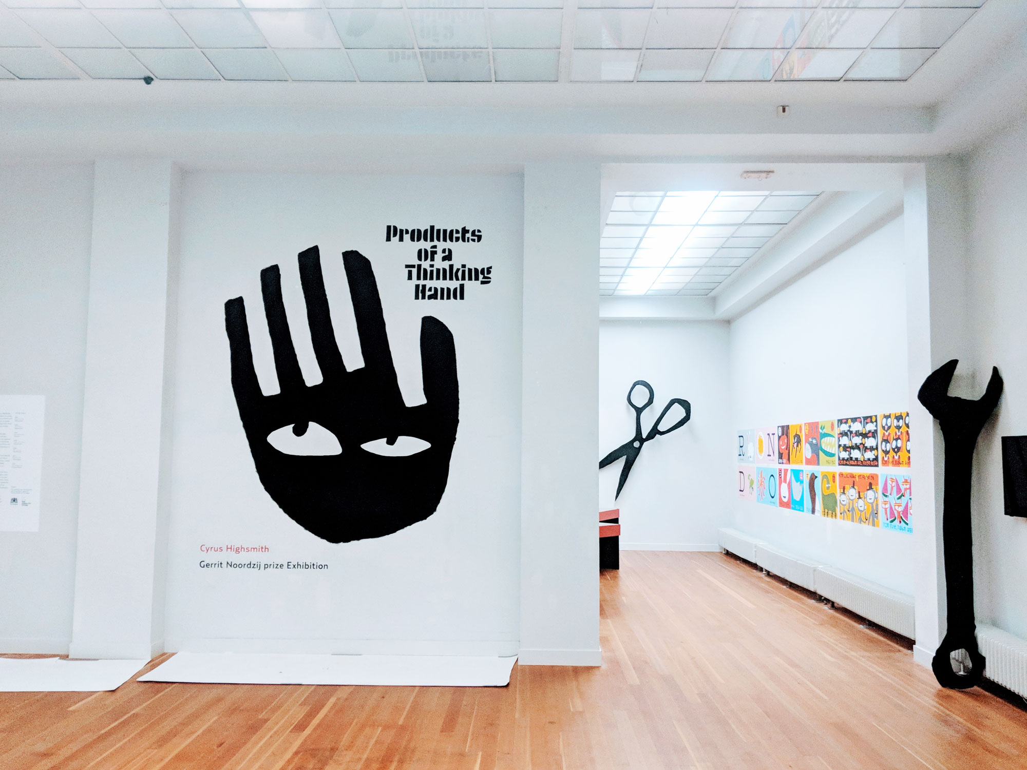
In 2017, Highsmith had a solo exhibition in Den Haag called Products of a Thinking Hand as part of the Noordzij Prize.

“Every three years, the Gerrit Noordzij Prize is awarded to a typographer, type designer or graphic designer. The prize is given to a person who combines practice in type design and typography with teaching and research. While there are awards for excellence in each of these qualities individually, the Gerrit Noordzij Prize focuses on the combination of the three, allowing these disciplines to influence and challenge each other,” states the jury’s report.

Past recipients of the Noordzij prize include Karel Martens, Tobias Frere-Jones, Wim Crouwel, Fred Smeijers and Erik Spiekermann, as well as Gerrit Noordzij himself.

The report continues, “With this prize, the jury expresses its appreciation for the high level of Highsmith’s typographic qualities and the way in which he manages to share these with the public. He moves with ease between complex and elementary parts of the discipline. His style is recognisable and original; whether he is working on a font or a large publication, on a children’s book or on an educational text, Highsmith uses the same sharp pen everywhere”.

Fonts